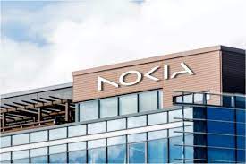
Nokia updates their logo to mark the beginning of a new era

Nokia updates their logo: Nokia will no longer use the colour blue and will instead use whatever is more fitting given the circumstances, so no specific colour scheme is assigned. Nokia is now a “enterprise technology company,” according to Lundmark, rather than just a maker of smartphones.
February 2023 Current Affairs Quiz
Nokia will focus more on selling equipment to other companies while also expanding its telecom equipment business. They include tools for automated manufacturing and private 5G networks, positioning the business as a rival to Microsoft and Amazon in the industry. A “three-phased approach to generate sustainable, profitable growth” is being developed by Nokia. Following the reset phase, Nokia will “continue to accelerate” in order to establish itself as “an unrivalled technology leader.” The announcement on Sunday is consistent with Nokia’s long-term financial objectives, which were reaffirmed with Q4 2022 results.
About Nokia’s New Logo:
In nearly 60 years, Nokia made the first change to the company’s brand identity. The rebranding is part of the Finnish 5G equipment manufacturer’s goal of expanding and “being in businesses where we can see global leadership.” The logo isn’t blue anymore. The word “NOKIA” is now rendered in a variety of colours and five different shapes. “The company’s new logo expresses the principles and mission of Nokia in a vibrant, energetic, and modern way. It was created as a representation of teamwork, which, in Nokia’s opinion, is essential for networks to reach their full potential and achieve improvements in sustainability, productivity, and accessibility.”
What’s Nokia’s plan?
Nokia is focused on four major “enablers” to meet the targets: creating future-ready talent, investing in long-term research, particularly in important areas like 6G, digitising internal operations to increase agility and productivity, and rebranding.
Nearly ten years ago, Nokia stopped manufacturing mobile phones. According to CEO Lundmark, the redesign was done to disassociate the company’s name from its products.